Choosing a game's face: Evo Squad's icon, logo and style poll
05.11.2026 · 3 min read
- #Evo Squad
- #design
- #game development
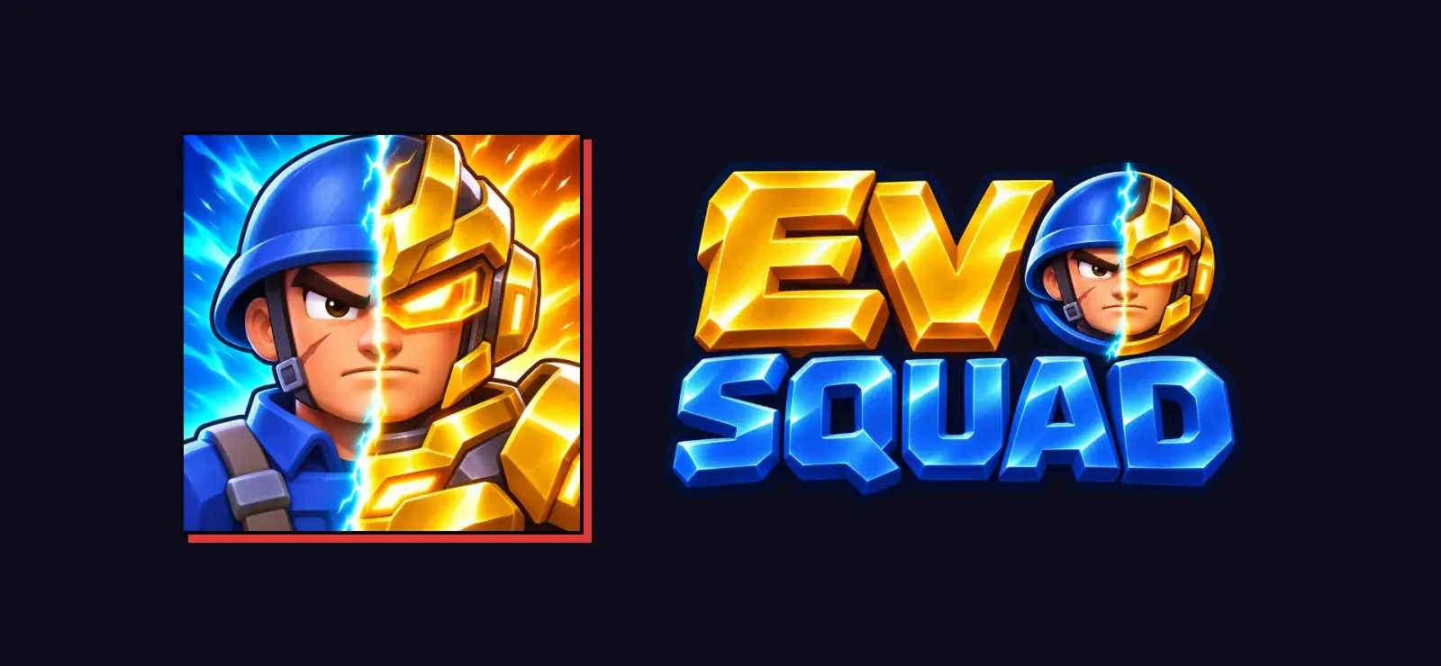
When Evo Squad's gameplay was finished, the game was still missing one thing: a face. The old app icon and logo didn't say where the game had come from. In the store, a game is introduced by its icon first, so that's where I started.
Six icons, one choice
First I had six icon ideas drawn, each telling what the game is from a different angle:
- Hero: A single soldier, close up.
- Charge: The squad rushing forward.
- Evolution: Half the face an ordinary soldier, half its evolved, gold-armored form.
- Gate: The most familiar moment of the game, the squad passing through a gate.
- Versus boss: The squad facing a giant enemy.
- Crest: A soldier-themed emblem.
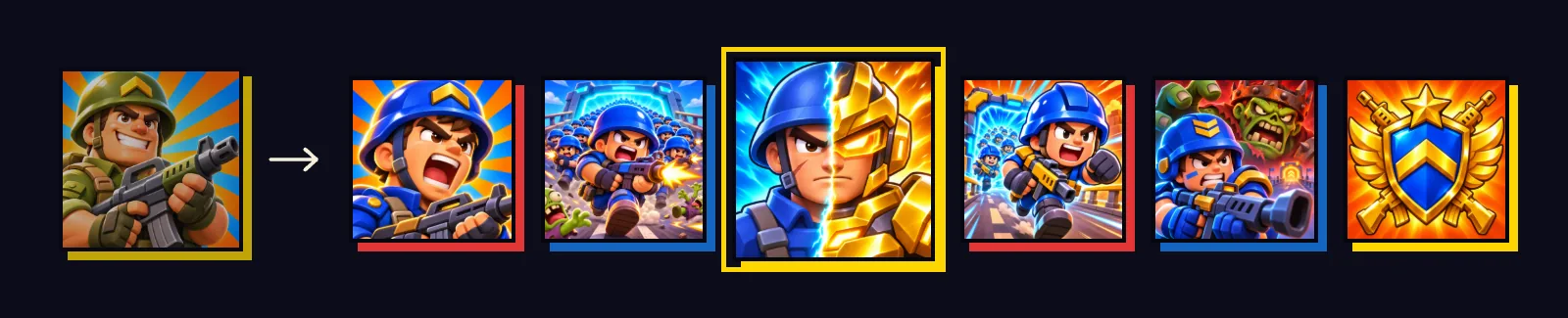
The icon I picked was Evolution. The game's name comes from evolution, and this icon tells the game's promise at a glance: an ordinary soldier turns into something else over time. The electric line between the blue-helmeted rookie and the gold armor also reads well at the small size it has in the store.
The logo continues the icon
I didn't want to think of the logo separately from the icon. I had four logo options redrawn with the Evolution icon as a reference: split, gold, emblem and rising.

In the emblem I picked, EVO is gold and SQUAD is blue steel, with the half face from the icon inside the O. The icon and the logo now complete each other. The logo is also used on the game's splash screen and on the transition curtain that closes when going into battle.
I had the icon and logo options drawn with AI image generation. Producing options takes minutes; the real work is knowing what to ask for, giving the right reference and deciding which one tells the game's story.
Style: cartoon, stylized or realistic
The next big decision is the style of the soldiers, zombies and icons inside the game. I had the same scene, the same two characters and the same icons drawn in three styles and put them side by side:
- A, Cartoon: Closest to the game today; soft and colorful, in the style of Clash Royale.
- B, Stylized: Sharper shapes, in the style of Fortnite and Overwatch.
- C, Realistic: The semi-realistic look of games like Last War.
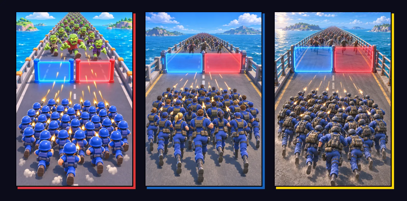
I didn't compare them only at full size. In the game, an icon is 28 pixels and a soldier is 46 pixels tall. I scaled the images down to those sizes and looked again. The realistic style that looks impressive large gets lost in the crowd when it's small.
I lean towards cartoon, for three reasons:
- Readability: With hundreds of soldiers on screen, colorful and soft shapes are easier to tell apart.
- Production time: The models will be made in Blender; a realistic style means much more time for every model.
- Consistency: The game's interface and its 139 icons were made for this style.
The followers decide
Still, this game grew together with the people who have followed its development from the start. They were the ones who wrote in the comments that the map was too narrow and who answered what the next weapon should be. So I asked them about the style too: on Instagram I showed the three styles side by side and asked for a vote, A, B or C.
Whichever letter wins, the new models will be made in that style. I'll share the result and the new look on Instagram, TikTok and YouTube. The game as it is today is on the Evo Squad page.